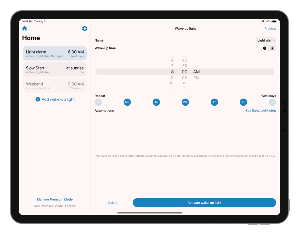
Wake Up Light version 4.1 was just released with a redesigned layout for iPad. This new split screen layout makes more use of the big screen of an iPad compared to the compact screen of an iPhone.

Wake Up Light received a fresh screen layout that combines the overview with a detailed screen about your wake-up alarm in a beautiful split screen. Now you can use your bigger screen to set up your light alarms, adjust their times, change their gradients and setting like you could on your iPhone.
The updated layout follows the new release of Wake Up Light on macOS. Based on that release, Wake Up Light adopted the same split screen layout for macOS and iPadOS. In future updates, the design of iPad and macOS keep getting refined. Stay tuned for more updates for the app that creates wake-up lights based on your HomeKit devices.
Do you have feedback regarding the new version? Don’t hesitate to contact me. And make sure to download the app for macOS, too!


